1: anon
itt(このスレで):画風の劣化
itt: art style degradation
itt = “in this thread” の略。「このスレで〜していこうぜ」という定番の振り。
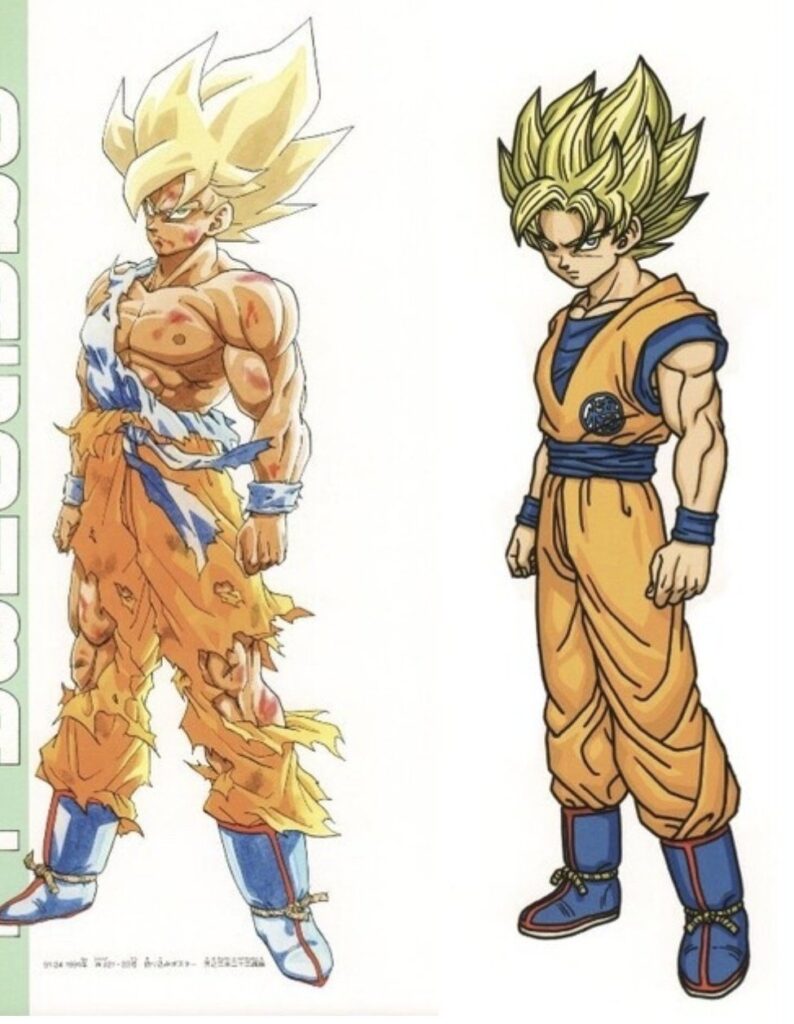
2: anon >>1
いや、右のほうが良くなってるだろ
right looks better
3: anon >>1
やっぱりナメック星編が頂点だわ
yeah Namek was peak

4: anon >>1
これ、たった2年くらいの間に起きたんだよな。史上もっとも急激な劣化かもしれん。あの2年間で一体何があったのかは、たぶん永遠の謎だわ
this happened in the span of like 2 years, maybe the most radical decline ever seen
it’ll probably be an eternal mystery what the fuck happened between those two years
it’ll probably be an eternal mystery what the fuck happened between those two years

5: anon >>1
燃え尽き症候群だよ。週刊少年ジャンプの漫画家にはよくある末路だ
The man is burned out, a common fate for Shonen Jump mangakas.

6: anon >>5
あの人は燃え尽きを避けるためにやるべきことは全部やってたんだよ。長期休載も取ったし、自分の個人プロジェクトもやったし、毎月休載週を入れて、ページ数も20pから15pに減らした。それでもなお、画力的には全盛期から完全に落ちて、最低レベルまで行っちまった。
he did all the things that a mangaka should to avoid burnout though. he took a long hiatus, worked on his own personal projects, took break weeks every month, decreased page count from 20 to 15.
even so, he completely fell off from what can be considered his peak to his absolute lowest, art wise.
even so, he completely fell off from what can be considered his peak to his absolute lowest, art wise.
7: anon >>1
高橋留美子。これ見てると悲しくなる…らんまのこれ、一体何なんだよ
Rumiko and it makes me sad what the fuck is that ranma

8: anon >>1
鳥山明の後期の絵が悪いとは思わないけど、ドラゴンボールには合ってなかったんだよな。DB完結後は主にドラゴンクエストの仕事をしてたから、画風がDBよりDQに合う方向へ大きくシフトしたのも納得ではある
I don’t think Toriyama’s later style was bad but it just didn’t fit Dragon Ball. Since he mainly worked on Dragon Quest after DB ended, it makes sense why his style shifted heavily towards something that fit DQ instead of DB.
9: anon >>1
>なぜ絵は劣化するの?故意なのか、それとも自然と?
単なる作風の変化って場合もある。鳥山明はもっと丸っこくて、コメディ寄りで、軽い感じに戻したかった。加齢や健康悪化による消耗って場合もある。富樫はまさにそれで、体調や生活習慣の問題もあって、ほとんどネタ扱いされるようになった。あとはアシスタントに作業を任せた結果って場合もあって、ベルセルクが後半でかなり雰囲気が変わったのはこれ。たいていの作家は「劣化させよう」なんて思ってないけど、もし意図的なら、ちょっと遊んでるか、注力する方向を変えたかのどっちかだ。
たまにナルトみたいに、岸本がアニメっぽい見た目にしたくて作画の手間を減らした結果、線が綺麗になりすぎたってパターンもある。
単なる作風の変化って場合もある。鳥山明はもっと丸っこくて、コメディ寄りで、軽い感じに戻したかった。加齢や健康悪化による消耗って場合もある。富樫はまさにそれで、体調や生活習慣の問題もあって、ほとんどネタ扱いされるようになった。あとはアシスタントに作業を任せた結果って場合もあって、ベルセルクが後半でかなり雰囲気が変わったのはこれ。たいていの作家は「劣化させよう」なんて思ってないけど、もし意図的なら、ちょっと遊んでるか、注力する方向を変えたかのどっちかだ。
たまにナルトみたいに、岸本がアニメっぽい見た目にしたくて作画の手間を減らした結果、線が綺麗になりすぎたってパターンもある。
>Why do artists art degrade? Is it on purpose or accidental?
Some of it is just shifting in style. Toriyama wanted to become more rounder, comedic, lighter again. Some of it is wear; Togashi basically became shitposting material most of the time because of age and degrading health, poor care of himself. Some of it is offloading work onto assistants, which is how Berserk kinda became very different in its own ways later on. Most artists don’t intend to “degrade”, but if it’s intentional it’s either to fuck around a bit or to just change their focus.
Though you do occasionally get shit like Naruto just becoming too damn clean because Kishimoto wanted to make it look more like the anime and cut down on detailing work.
10: anon >>9
少なくとも尾田の場合は乱視、つまり単純に視力が落ちていってるんだよ
At least in the case of Oda, it was astigmatism, just losing your eyesight.
11: anon >>1
>尾田は時間跳躍(2年後)編のあたりで禁煙した
>それ以来、作画の質はずっと落ち続けている
いいか子供たち、タバコは吸いまくれよ
>それ以来、作画の質はずっと落ち続けている
いいか子供たち、タバコは吸いまくれよ
>Oda quit smoking around the time skip
>his art has degraded steadily in quality ever since
Remember, kids: smoke excessively.
>his art has degraded steadily in quality ever since
Remember, kids: smoke excessively.
12: anon >>1
右のほうが断然いいだろ。これは”作風”ってもんだよ、お前ら。左はむしろ、絵を習いたての奴が描いたやつにしか見えん
right is much better. it’s called style you morons. left looks like what someone who is just learning how to draw would do.
13: anon >>12
はいはい、ピカソ大先生
ok picasso
14: anon >>1
個人的には、コミさん(古見さんは、コミュ症です。)が一番分かりやすい例だと思う
Komi-san is the most blatant one IMO

管理人のひとこと
キャラの造詣が最初と現在で変わっているのはあるあるだよね
出典
- 元スレ:https://desuarchive.org/a/thread/288505644
- 板:4chan /a/(archived via desuarchive)
- スレ立て日時:2026年6月3日
- 総レス数:222